
Work Of Art
“Every great design begins with an Even better Story”
-LORINDA MAMO

The Origin Story
Michael Kupietzky opened up his business in 1998, he is a Judaica artist and designer. Michael was approached by a prominent Judaica client and was asked to find him an apartment in Israel. He then later asked him to design the interior and hire various contractors. Through doing this project Michael gained experience and know-how. Friends of his client were impressed with Michael’s work and sought him out. Today Michael has a full staff that includes an architect, window specialist, carpenters, furniture makers, and importers.
Problem
The current site is not getting enough traffic, the UI needs to be updated and the overall flow feels complicated and confusing.
Hypothesis
With The relaunch of A work of art, I think the website will gain more traffic. By improving the site’s user experience and making this site reflect the unique attributes my client has to offer I can draw more traffic to the site.
If your not big on reading, then skip to the end to see
Research
Market Research - Market Trend - Provisional Personas - Competitive analysis - Interviews
Market research
My Market research showed me that the best way to design an interior design website is to tell a story throughout the site. When telling a story a designer must keep the user engaged by telling a good story but also using the right amount of color and animation. Tell the user who the designer is and why they should use them. I learned that it doesn’t matter how much work the designer shows, but what they’re showing because at the end of the day the site is the designer’s portfolio, and so the same rules apply.

Market trends
Feature a blog you will enjoy reading to learn the seasonal trends, expert advice, and the best tips for every style and space. Add fun splashes of color, a nice animated portrayal of sketches becoming actual interiors, and navigation designed in the style of a technical sketch. Another nice trend would be Smooth animation and a convenient portfolio slider, which allows studying the work closely, even in preview mode. Last clickable buttons and menu elements are shown how by highlighted unobtrusively on mouseover, which looks like a very neat solution.

Provisional personas
Each competitor gave me so much to think about, From the different kinds of layouts in terms of navigation, to the categorization of all the information. Each site was overall that they’re great, some more than their others. The ones that stood out the most, were the ones that told me their story and in their unique ways.


Competitor analysis

Interview conclusions
The website needs to represent who Michael is as a designer, but also show each project which will represent each client's vision. Let the user know that this is a one-stop-shop by having a page explaining that but also showing the process when clicking on each home. Have the site be set up in a way that keeps the user engaged by having different animations. Categorizing is very important, we saw this in the research and the interviews. Keep the website cohesive. Quality over quantity.
UX Deliverable
Persona

The persona I created has clear goals which were based on my previous research. The main goal for this persona is to understand more about the process of building a home and get to know that designer and his team. When creating this site I felt that the way to best tell the story is through the team which represents personal the different characters in the story. I left the frustration portion of the persona to represent the feedback I received and found with his current site. Last the persona’s motivations are based on my provisional personas and based on previous clients of the interior designer.
Sitemap

The sitemap shows the layout of the site, this sitemap is simple since the site is just in the first stages. Later on, I will be adding more features. For now, I divided the site up into these six sections all based on past research. The spaces section I found a need for during my provisional personas stage of research, The about and contact pages are standard, The past project and our services pages were based on the competitive analysis. In addition, I found that my team was based on all the research I conducted but only while working on my persona did I see a need for it. When creating the sitemap I felt like it all fell into place, probably because there are so many existing interior design sites and so the base of the sitemap was already there.
User Journey

This is the journey a user goes through when viewing the site in full. The user views the site in two ways, either by viewing past projects or by viewing different spaces in the home to get a taste of the work the designer has done. Following the user would as well like to see the team and the head designer to learn more about who he is, as well he would view the services page to get a greater picture of what the designer offers. Once reviewing all this information and the user likes what they see they would potentially go to the contact page and get in touch with the designer and began designing their new home.
Design
Wireframes
When creating the wireframes, I was limited mainly because my next stage for this website was to make it come alive and I didn’t have a programmer so I plan to work with Squarespace. When choosing my website platform on planned to Squarespace I wanted a simple design that was full of useful information.


UI kit
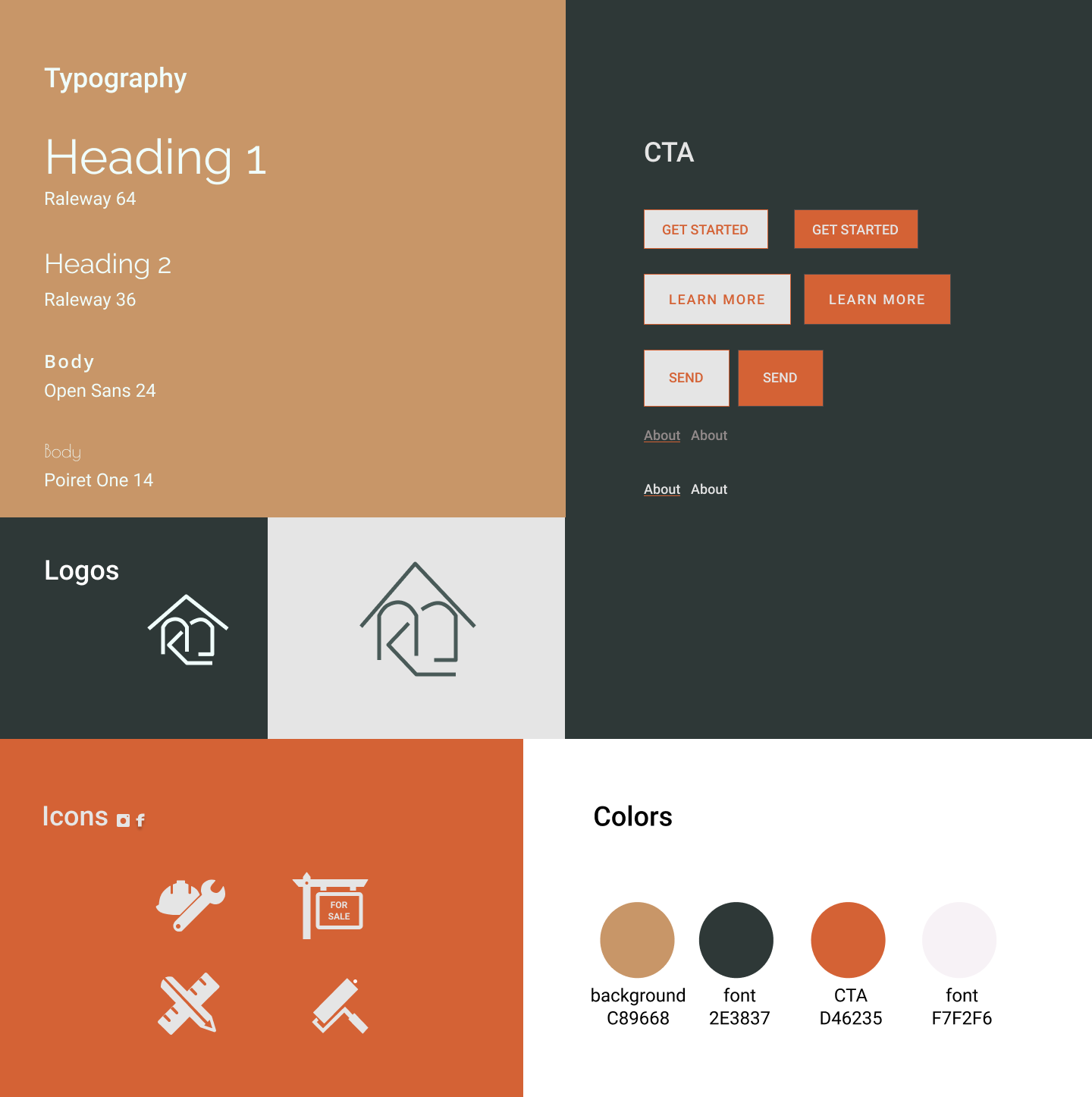
The color palette was chosen because I wanted to have a mix of calm and bold colors. Aside from that my client already had a pre-existing logo from a different business of his and felt he wanted to use the logo, what I did change was adding a triangle to the top of the log to create a roof and left the MK only to make it appear more in a box shape to resemble a house. This showed that a few small changes can make all the difference.
Affinity Map

This affinity map shows the pros and cons and solutions to those problems. The main navigation issue had to come with the Figma prototype but also some technical which were easy to fix. There were several comments I got about confusing naming for different sections on the site. For example, the projects were under the names of the past client and some felt that was an invasion of their privacy and so I renamed them to random male names which give some character to the page. After making these changes I was finally able to present my design.
High-Fidelity UI Design
/
Next steps
While working on this project, I learned so much about small businesses and how to create a website that caters to the business’s, needs and clients as well. I think next time I would spend some time seeing the business in person, in this case, I think seeing a few apartments would have helped me find the right questions to ask my client. My next steps for this website would be to fully develop it and later add a personal login for clients to reach out to and get updates on the development of their homes. In this project I’m proud of the transformation the website went through, the site is now user-friendly with so much useful content.